Make it easier to navigate through a complex site providing cybersecurity research and training.
Individuals would get lost when visiting the website and complained about how hard it was to find the help or assistance they needed.
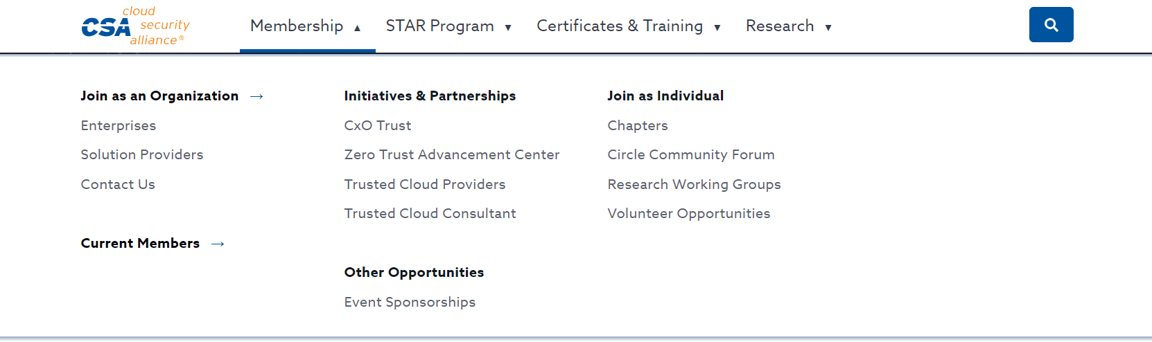
We took a website with four levels of navigation, changing submenus, and a disorganized footer, and restructured the content and navigation options to make it easier for users to navigate through the website and complete key tasks.
I worked on this project during my time at the Cloud Security Alliance (CSA). This organisation offers cybersecurity research, training and support to individuals and companies across the world.
Research
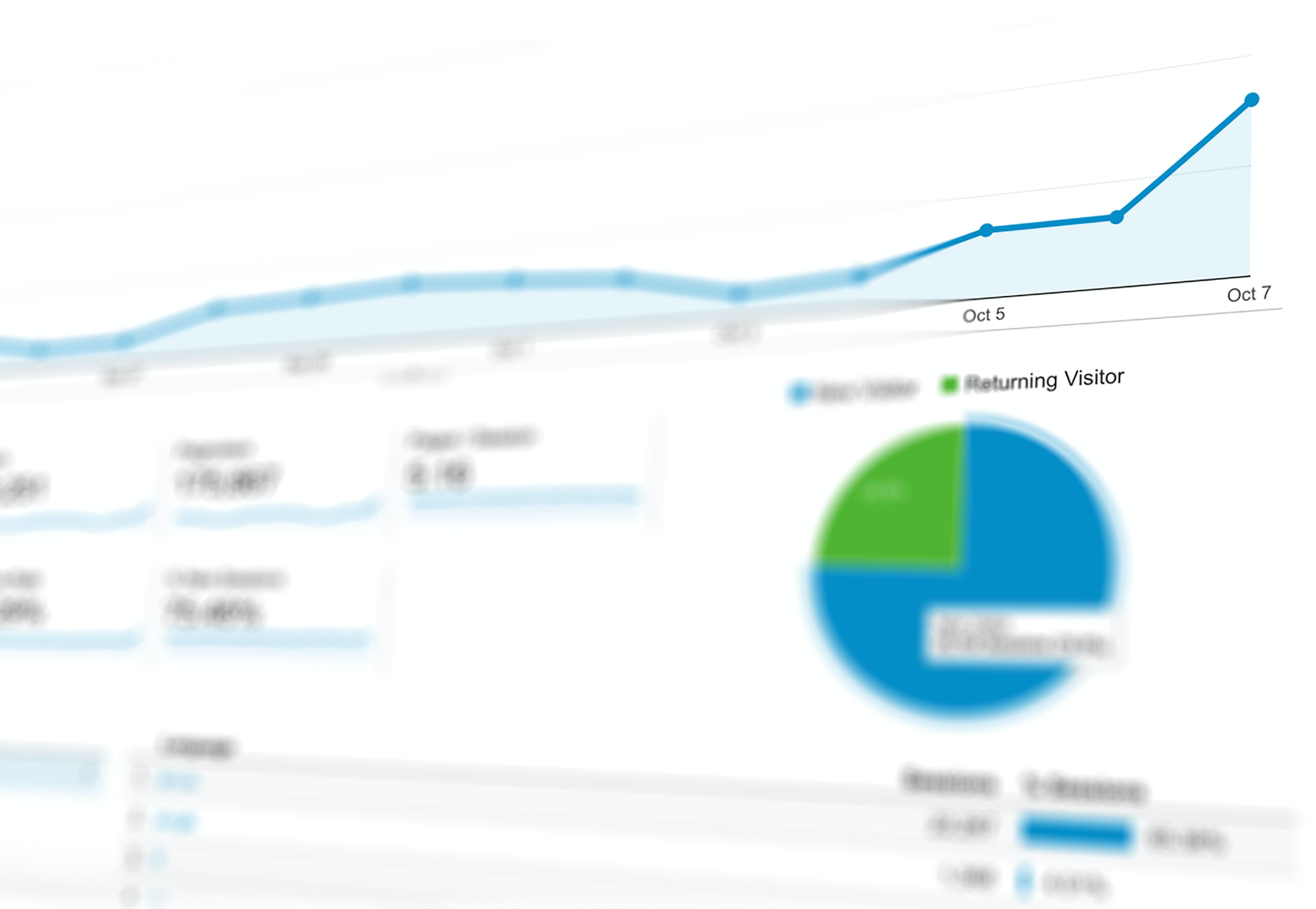
Google Analytics
Used analytics to identify key pages visitors exited the site or seemed lost their way within the site structure.

SEO Keyword Research
In order to understand what terms website visitors use to find items, I used Google Search Console, Moz, AdWords Keyword Planner, Answer the Public, Quora, Reddit and SEMRush.

Benchmarked Against Competitors
Analysed and identified trends across top competitor's sites, including: IBM, Gartner, AWS and GitHub.

User Interviews
Interviewed users who visited the site frequently to understand what areas tripped them up.

Social Media Comment Analysis
Analysed social media forums such as Reddit, Quora, LinkedIn, and Answer the Public to understand the top questions people asked and words they used to frame their questions.

Stakeholder Interviews
Met with key stakeholders who interacted with customers on a regular basis (such as the sales team) to understand what issues they were hearing from clients.
Issues 1
Individuals vs Organisations
The navigation for individuals was blended with options for organizations. However, the process used to search for information for these two groups differed completely. This created a lot of confusion across the site.
Solution
During research I identified which terms and phrases were primarily used by individuals searching versus managers searching for resources for their team. We then restructured the information so it was presented in the format most intuitive to the users.
Issue 2
Use of acronyms and branded terms
Another key area of confusion was the use of acronyms and terms that weren’t widely known or understood by individuals unfamiliar with the organization.
Solution
Where possible acronyms were replaced with more commonly used terms identified during the user research phase. Otherwise all other acronyms were spelled out.
Issue 3
Inconsistent navigation options
Navigation and menu options changed for users as they navigated. This made it tricky for users to orient themselves across the site.
Because of this users would get lost when visiting niche research pages.
Solution
In the new menu structure I suggested a consistent pattern for menus across the site and a sticky mega menu they would see no matter which page they visited. This would ensure that no matter which areas of the site they visited they would be able to orient themselves and easily navigate to other areas of the site.
Before / After
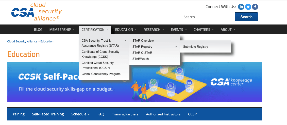
Before
There was a three-tiered level of navigation. The menu options changed across the site, and the UI made it tricky to use on mobile.
After
The revised navigation ensured menu items remain sticky, preventing options from vanishing if the user unintentionally shifted their mouse. It also incorporated new categories guided by research I performed.
Results
After the navigation changes we saw an increase in page visits to under-navigated pages on the site that the company wanted to drive traffic to. Most notably, we saw less accidental page traffic within the training pages. Individuals looking for training for themselves were able to find what they needed quickly versus accidentally visiting the section dedicated to corporate certification schemes.
The returning site visitor traffic also increased, which was a key goal of the company as it wanted to build a community of cybersecurity professionals who would visit the site regularly for research and training updates.
2023